Before you cook up another pie, consider these alternatives
Every time I see a 3D pie chart made in Excel, I die a little on the inside.
When working in data visualization, you hear all sorts of opinions on pie charts. Some people feel they should never be used. Mathematician John Tukey felt there was no pie-chart data that couldn’t be better displayed in any other type of chart. Other people really like them.
Unlike Tukey and design theorist Edward Tufte — who said, “The only worse design than a pie chart is several of them” — I am not of the opinion that pie charts should never be used. I just think they should be used less often.
I have sensed similar feelings toward Excel spreadsheets. They have even earned the nickname “walls of data.” The connection here is that pie charts and Excel spreadsheets are both overused and stretched to do things they were not meant to do. However, just like you wouldn’t remove colors from the painter’s palette and say, “No more green for you!” I don’t think the solution is to delete Excel and pie charts off everyone’s computer. Perhaps it’s more about making sure the painter has more colors to pick from.
Most existing content on this subject of pie-chart dislike will just direct you to a bar chart or line chart instead. But I have challenged myself to show you five unusual alternatives to boring data visualization. Here they are, ending on the one I like most…
Dumbbell Chart 🔗
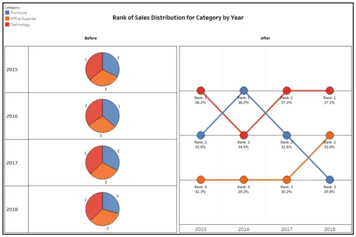
One of the most common abuses of pie charts is to use many of them together to display change over time or across categories. If the primary message you want to send to your viewer is variance, it’s helpful to know that humans are really good at detecting and valuing the distance between objects. The dumbbell chart, also known as the DNA chart, is a great way to show change by using visual lengths.
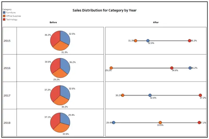
From a visual perspective with the dumbbell/tri-bell presentation, it is easy to see that in 2018, furniture had a lower sales distribution than office supplies and technology. By contrast, the pies all look like peace signs, and it is really hard to know both the rank across the categories and how they have changed year over year.
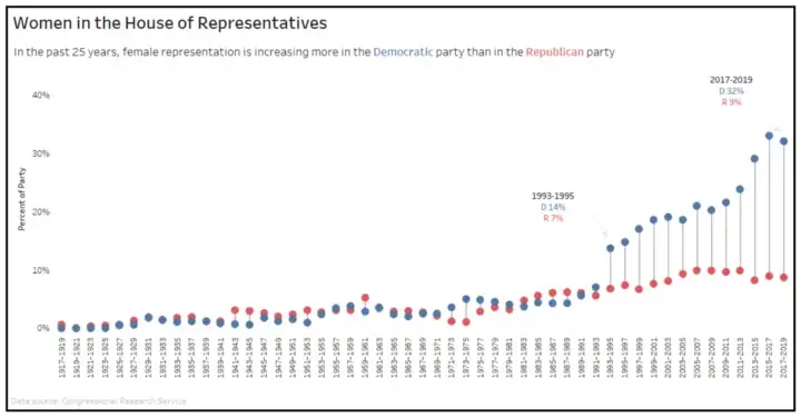
Here’s a great dumbbell chart example that reflects the increase of women in the House of Representatives as it relates to party:
Bump Chart 🔗
Variance may not be important to you. Maybe you want to show a ranking among the categories over time. Then I would point you to a special version of a line chart called the bump chart. Here’s the same information as in the previous example expressed a bit differently:
The greatest pro for the bump chart is that it’s really effective at visualizing ranks. But, for the cons, they can get noisy if ranks change a lot or if you have many categories. And like with the dumbbell chart, viewers likely won’t realize you are comparing parts with the whole.
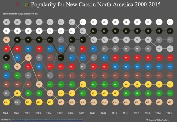
Here’s an effective bump chart example that displays the popularity ranks of new car colors and how they’ve changed over 16 years:
Donut 🔗
The first two suggestions are certainly different approaches to variance and ranking, but sometimes you need a simple way to convey the parts with the whole. It may be important for a viewer to quickly know that something adds up to 100 percent. And maybe you just like the shape of circles because they symbolize many good things, like the sun or wheels — or donuts.
Check out how even though it’s the same shape as a pie chart, the donut conveys information a bit differently:
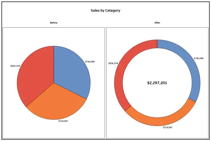
Because people are so overexposed to pie charts early and often throughout their lifetimes, there’s a key advantage in translating the info to a donut — it speeds up the time it takes the viewer to decode the parts and the whole of the visualization.
(On a side note, do you ever wonder if there is a correlation between people who like donut charts and stuffed-crust pizza? I do. Please send me that data set.)
The pros of a donut chart are that it’s effective at showing parts within a whole, but unlike a pie chart, it frees up white space at the core to throw in a total, call out a number, or add another data marker. It can also be used as a gauge to call out a single percentage.
The cons are that it’s hard to interpret things like variance and rank, and humans generally aren’t as good at registering the differences in the ring’s filled-in angle area as with other easy-comparison formats like bar charts.
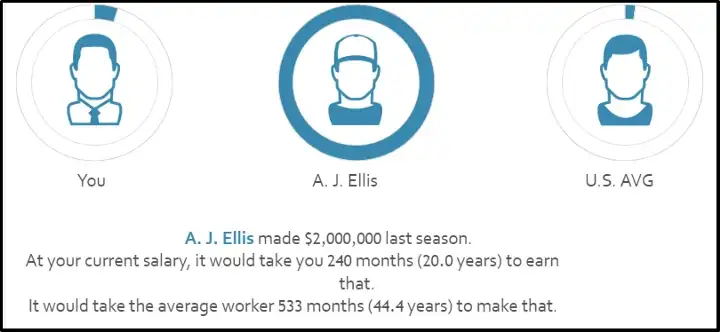
It can be done, though. Here’s an example of a donut that is effective at using the ring’s shading to display salaries in proportion to each other:
Treemap 🔗
A primary argument against the pie chart is that humans are not good at detecting differences between angle sizes. Treemaps alleviate this by using area instead of angles to designate proportion. Using the same data as in the donut format above, this version uses sized rectangles:
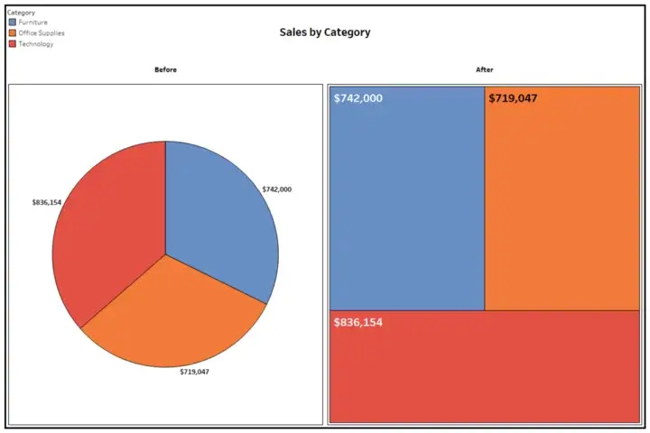
In addition to the pro of displaying data with area space rather than angles, treemaps are more useful than pie charts when there are more than five categories (avoiding the sometimes hard-to-label pie slivers) and in visualizing subcategories within categories. The main con is that people are much less familiar with this format.
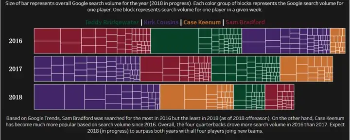
Here’s another treemap example that aims to show a lot of comparative information in its visualization of the weekly volume of Google searches of four football players across years:
Waffle Chart 🔗
The waffle chart is a really fun chart and probably my favorite alternative to pie charts — and not just because it’s also named after food. Because it’s typically made with 100 squares representing the whole, it can be shaded or filled based on the relation of several parts to a whole, just like a pie chart, but it’s also good for displaying a single percentage.
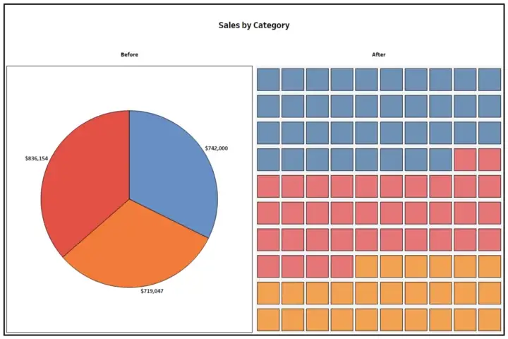
The key pro is its diversity in being able to show individual parts of a whole and compare single percentages, but another advantage — similar to treemaps — is that proportions are more clearly represented by area instead of angles.
The cons are that it becomes too complicated when too many segments are involved, and the individualized spaces don’t leave a good spot to put numbers or much text within the visual itself.
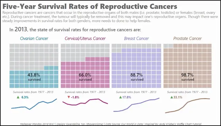
Here’s another waffle chart example that neatly displays comparative survival rates for types of cancers:
These are only a handful of diverse and creative ways you can visualize data. I also considered other unusual diagram alternatives: Marimekko charts, Sankey flow diagrams, radial pie charts, and sunburst charts.
Let me just leave you with one last 3D pie chart: