
How to leverage emotional design in your process.
Have you ever thought about why some analytics dashboards are just so appealing and easy to use, while others make you feel overwhelmed and frustrated? The answer lies in emotional design. Emotional design refers to the way in which design elements evoke emotions in the user, making the experience of using a product more memorable and enjoyable. In the world of analytics dashboards, where data visualization and interaction are key, emotional design plays a critical role in determining user engagement and satisfaction.
Emotional design is not just about making things look pretty. It’s about creating a design that speaks to the user’s emotions and motivations, making them feel understood and valued. A well-designed dashboard not only presents data in a clear and meaningful way, but it also creates a positive and engaging experience for the user.
Whether you’re a data analyst, dashboard designer, product manager or simply someone interested in the intersection of technology and emotions, this article is for you.
The Basics of Emotions 🔗
Emotions are a fundamental aspect of the human experience. They are our internal response to external stimuli, and they shape the way we perceive the world around us. Emotions are what make us feel alive and connected to each other. They are what gives us the capacity to experience joy, sadness, excitement, anger, and a wide range of other feelings.
Artists, such as songwriters and movie makers, have long recognized the power of emotions to connect with their audience. Songs and movies use emotions to evoke powerful responses from their audience. Whether it’s a heart-wrenching ballad or an action-packed thriller, music and movies use the power of emotions to create an unforgettable experience for their audience.
The same is true for design, especially emotional design. By leveraging emotions, designers can create products that deeply resonate with their users. Designers can tell a story, evoke feelings, and create a connection between the user and the product. It’s a powerful tool that can turn an ordinary product into an unforgettable one.
What is Emotional Design? 🔗
Emotional design is the practice of designing products in a way that elicits emotions from the user. This can be achieved by using colors, shapes, and other design elements that are intended to create a particular emotional response. Emotional design is about creating a user experience that is not just functional, but also memorable and enjoyable. It’s about designing with the user’s emotions in mind, so that they can form a connection with the product and feel engaged and satisfied.
Understanding the connection between emotions and design 🔗
Design has the power to evoke both positive and negative emotions in users. On one hand, good design can create feelings of joy, excitement, and satisfaction. A well-designed product is intuitive, easy to use, and makes the user feel confident and in control. The connection between emotions and design is not to be taken lightly. A product that elicits positive emotions is more likely to be successful and create a lasting impression on users. On the other hand, a product that elicits negative emotions is likely to be forgotten and abandoned. Understanding the connection between emotions and design is critical to creating products that are not only functional, but also enjoyable and memorable.
In today’s highly competitive business world, it’s essential to understand the emotional impact of design on users. Business applications often underestimate the level of emotions in their users and focus solely on functionality, overlooking the emotional experience. They talk about “pain points” but fail to appreciate how painful these digital tools can be for users. However, it’s crucial to recognize that pain results in strong negative emotions, leading to dissatisfaction and abandonment of products. Well-designed apps that generate true, strong, and significantly positive emotions can generate billions of dollars, as seen with Instagram.
The role of emotions in user experience 🔗
When it comes to designing for users, it’s important to understand their needs and motivations. One famous theory that explains human motivation is Abraham Maslow’s hierarchy of needs, which states that people are first motivated by basic needs (like food and shelter) and, as those are met, they move on to pursue higher-level needs like love, self-esteem, and creativity.
Aarron Walter, in his book “Designing for Emotion,” takes a similar approach and describes a hierarchy of user needs. undefined
In other words, a beautiful application that isn’t functional won’t be appreciated, no matter how gorgeous it is. And even if the interface is functional, if it’s unreliable or difficult to use, users won’t be satisfied. It’s only when a product is functional, reliable, and usable that users can appreciate the delightful or enjoyable aspects of their experience.
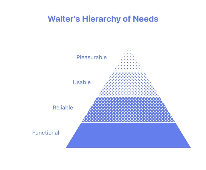
When designing for emotions, it’s crucial to keep in mind the hierarchy of user needs. Start by ensuring that your product is functional, reliable, and usable, and then work on adding the delightful and pleasurable aspects that will create positive emotions for users.
The impact of Emotional Design on User Engagement 🔗
Users are more likely to stick around and continue using a product or service when they experience positive emotions during their interaction. By designing for emotion, designers can create a user experience that not only meets the functional needs of users but also creates a strong emotional connection, leading to increased user satisfaction and loyalty.
Our emotions are more powerful than our rationality. Handling emotions is the job of the right part the brain, which in this context is stronger than the left brain, which is the logical and rational part. Sometimes we purchase things just because we want them, even if our rational brain says it’s too expensive. We also tend to choose products that look good and are pleasing to the eye. However, if a product doesn’t offer something extra or if we can’t establish an emotional connection with it, we won’t come back to use it again.
The interesting thing about emotional design is that it does not require the same amount of advertising as non-emotional design. When users have a positive emotional response to a product, they are more likely to talk about it with others, share it on social media, and recommend it to their friends and family. This can lead to a ripple effect of organic growth and increased brand awareness.
One example of emotional design in action is Apple’s iPhone. Apple’s iPhone is designed with a focus on aesthetics and user experience, incorporating emotional design principles to create a product that elicits positive emotions from its users. As a result, iPhone users have been known to be very loyal and enthusiastic about their devices, often recommending them to others and creating a buzz around new product releases.
Another example is the fitness brand Peloton. Peloton’s exercise equipment is designed to be more than just functional; it incorporates elements of emotional design to create a sense of community and belonging among its users. The company’s app allows users to connect with others in real-time, take classes together, and compete with one another. This emotional connection has helped to create a loyal and engaged customer base that promotes the brand through word-of-mouth.
By creating a positive emotional experience for users, businesses can tap into the power of word-of-mouth promotion and create a loyal customer base that will continue to promote the brand over time; plus, people are more likely to remember and recommend a product where they feel an emotional connection.
Best practices for incorporating Emotional Design in Dashboards 🔗
Applying Emotional Design to Dashboards 🔗
Dashboards play a crucial role in delivering meaningful insights to users and helping them make informed decisions. Just like in the hierarchy of user needs, a dashboard must first fulfill the basic needs of functionality and usability before moving onto higher level needs like delight and pleasure. A functional dashboard should accurately display the data and provide relevant information to users. It should also be reliable and not crash or malfunction.
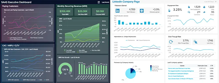
Using color psychology in dashboard design can greatly impact the user’s emotions and behavior. For instance, the color blue is often associated with trust, calmness, and security, making it an ideal choice for financial and healthcare dashboards. On the other hand, red is associated with urgency and warning, making it suitable for notifications and alerts. Using a consistent color scheme can also improve the user’s experience and make the dashboard easier to navigate. However, designers should be careful not to use too many colors or conflicting color schemes, which can lead to confusion and overwhelm the user. By using color psychology effectively, designers can create dashboards that not only look good but also function intuitively and enhance the user’s experience.
Designing intuitive navigation and interaction is crucial for creating a positive user experience on a dashboard. Users should be able to easily find what they are looking for and understand how to interact with the dashboard. Navigation should be clear and consistent throughout the dashboard, with meaningful labels and easily recognizable icons. The placement of navigation elements should also be logical and easy to access. Interaction should be intuitive, with clear feedback provided to users when they interact with elements on the dashboard.
Personalised onboarding 🔗
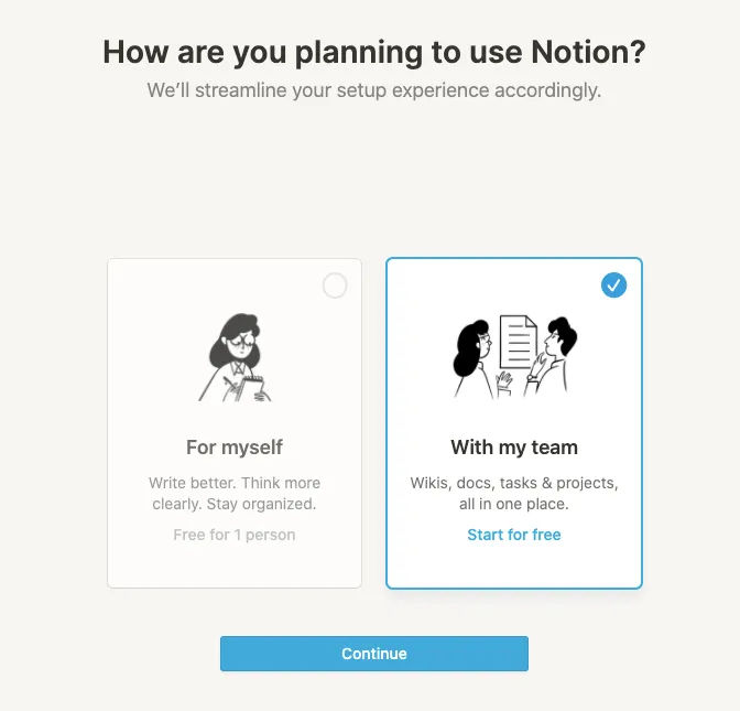
Have you ever tried to sign up for an app or website, only to be greeted with a generic onboarding process that doesn’t quite fit your needs? It can be frustrating and make you feel like just another user.
But imagine if the onboarding experience was personalized just for you. It would make you feel special and valued, right? That’s the power of personalized onboarding.
Notion is a great example of a company that understands this. They have a customized onboarding flow that categorizes users into two segments, with everything from the images to the microcopy tailored to each segment. This level of personalization helps to make the user feel understood and valued, ultimately leading to a more positive user experience and better business outcomes.
Humanise your copywriting 🔗
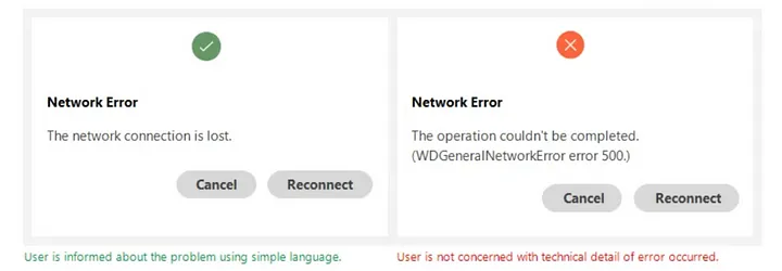
Adding a human touch to your dashboard UX writing can have a significant impact on user engagement and overall satisfaction. By using funny messages for errors, tooltips, and video explanations, you can create an emotional connection with your users and enhance their experience.
Humorous error messages can help alleviate the frustration and stress that users may feel when something goes wrong. Instead of feeling annoyed or upset, they may be more likely to laugh and move on. Similarly, using witty tooltips can make learning and exploring the dashboard more enjoyable and memorable.
After all, when things go wrong, do you really want a cold robot telling you “No data available” or a friendly message like “Well, this is awkward. It seems like we couldn’t find any data that meets your current filter criteria. Maybe try loosening the filters a bit? We’ll do our best to bring you some results!” It seems quite clear that users would appreciate and prefer more humanized copywriting in their dashboards and make our users feel like they’re talking to a friend, rather than a robot.
Incorporating video explanations can also be a powerful way to humanize the dashboard experience. Video allows users to see and hear from a person, which can help build trust and increase engagement. Additionally, videos can be more engaging than text alone, making it easier for users to learn and understand the dashboard.
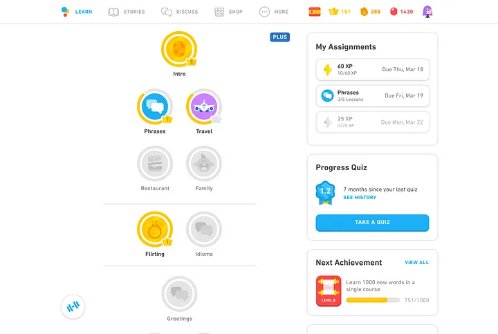
Evoke positive emotions with gamification elements 🔗
Gamification elements have been proven to be effective in engaging users and evoking positive emotions, which can improve their overall experience with the dashboard. By adding game-like features such as progress bars, badges, and leaderboards, users are motivated to achieve their goals and compete with others.
For example, LinkedIn uses a progress bar to encourage users to complete their profiles, while Duolingo uses a system of rewards and points to motivate language learners. These gamification elements create a sense of achievement and progress, which can improve users’ self-esteem and keep them coming back for more.
Additionally, incorporating social aspects into gamification can foster a sense of community and social connection. For example, Nike+ Run Club allows users to connect with friends and share their achievements, creating a sense of camaraderie and support.
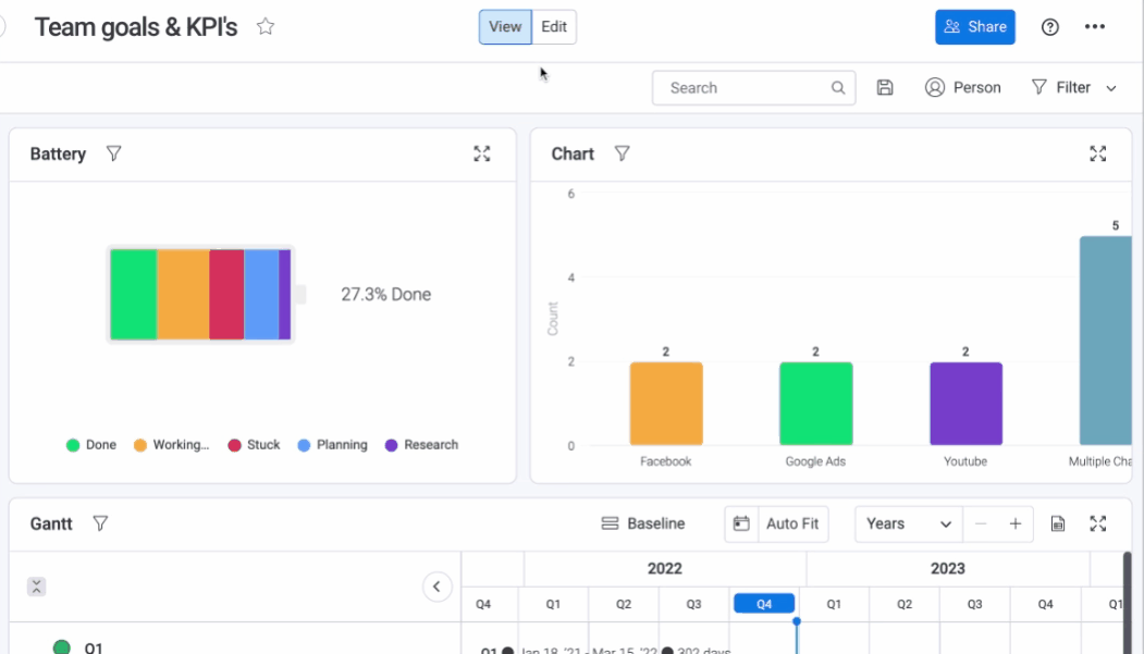
Dashboard customization 🔗
This is a great way to create a personalized experience for users. By allowing users to choose which metrics and visualizations they want to see, they can tailor the dashboard to their specific needs and goals. This can lead to increased user satisfaction and engagement.
Customization also allows users to focus on the metrics that matter most to them, without being overwhelmed by irrelevant data. This can help them make more informed decisions and take action more quickly.
Another benefit of dashboard customization is the ability to align the dashboard with the brand identity and style. By incorporating brand colors and logos, the dashboard can feel more cohesive and professional. This can help build brand recognition and trust.
Additionally, dashboard customization can help teams work more efficiently. By creating dashboards specific to each department or team, they can stay focused on their own metrics and goals, while still having access to company-wide data.
Test its effectiveness 🔗
Testing the emotional design effectiveness on users is crucial to ensure that the dashboard meets the desired user experience. A/B testing can be an effective method to compare the emotional design impact of two different versions of the dashboard. Additionally, usability testing can be used to gather feedback on the overall emotional experience of the users while using the dashboard. Surveys, interviews, and focus groups can also be used to gather feedback from users regarding their emotional response to the dashboard. Gathering both qualitative and quantitative data can provide valuable insights on the effectiveness of the emotional design elements incorporated into the dashboard. Based on the feedback obtained, designers can make necessary adjustments to ensure the emotional design elements align with the users’ emotional response, thus enhancing their engagement with the dashboard.
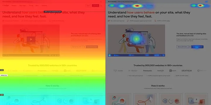
In addition to the methods mentioned, incorporating feedback response mechanisms in the dashboard can also provide valuable insights into the users’ emotional response. For instance, allowing users to rate their emotional experience using emoticons or providing a feedback button can help designers understand the effectiveness of the emotional design elements. Moreover, heatmaps and click-stream analysis can provide insights into the users’ behavior and identify potential areas for improvement. It is important to keep in mind that gathering feedback is an ongoing process, and designers should continuously analyze user feedback to ensure that the emotional design elements remain aligned with the users’ emotional response. Regularly incorporating user feedback can help designers identify and fix emotional design elements that may not be resonating with users, leading to a more engaging and emotionally satisfying user experience.
Challenges and Limitations of Emotional Design in Analytics Dashboards 🔗
Designing a dashboard that is both functional and emotionally engaging is no small feat. On one hand, you want to ensure that the dashboard provides the necessary information in a clear and concise manner. On the other hand, you want to create a design that evokes an emotional response from the user, which can enhance their engagement and experience with the dashboard.
One of the biggest challenges is finding the right balance between functionality and emotion. If you focus too much on functionality, the design may come across as cold and sterile, lacking any emotional connection with the user. On the other hand, if you focus too much on emotion, you may sacrifice functionality, making it difficult for users to navigate and access the information they need.
Another limitation is that what evokes an emotional response can vary greatly from person to person. Therefore, it can be challenging to create a design that appeals to a wide range of users. Additionally, the type of dashboard and the intended audience can impact the type of emotional design elements that are appropriate. For example, a dashboard for financial analysts may require a more professional and straightforward design compared to a dashboard for a wellness app, which may benefit from more playful and colourful design elements.
A different challenge lies in creating a design that appeals to a diverse audience without excluding anyone. For instance, colors and symbols can have different meanings across cultures, which can impact the overall user experience. Additionally, language barriers and varying levels of technological proficiency can affect how users interact with the dashboard. It’s important to conduct thorough research on the target audience and consider their unique needs. Incorporating localization features, such as translated text and currency conversions, can also enhance the user experience for a wider range of users. Designing for cultural and regional differences requires a balance between universal design principles and a deep understanding of the target audience’s unique cultural nuances.
Conclusion 🔗
- At the end of the day, it all comes down to making sure your product hits the right emotional notes with users. If people don’t feel good when they use your product, they’re not likely to come back for more. That’s why emotional design is so important. It’s all about creating an experience that users will enjoy and want to come back to.
- Your product needs to meet the user’s needs, but it also needs to make them feel good about using it. It’s like that friend who always makes you feel good after hanging out with them. You want your product to be that friend.
- So don’t forget to consider the emotional aspect of design when creating your product. You don’t want to leave your users feeling like they wasted their time and energy on something that didn’t leave them with a good feeling. Remember, happy users equal successful products!
Future outlook for Emotional Design in Dashboards 🔗
As businesses continue to focus more on user experience and customer satisfaction, emotional design will become an even more crucial element in dashboard design.
One trend that’s likely to emerge is the use of personalized emotional design, where dashboards are designed to evoke specific emotions based on individual user preferences or personality traits. For example, a dashboard designed for a data analyst may be different from one designed for a marketing professional, as they may have different preferences in terms of color, layout, and overall aesthetics.
Another trend that’s likely to emerge is the integration of emotional design with artificial intelligence and machine learning algorithms. By analyzing user behavior and preferences, AI and machine learning can optimize the emotional design of dashboards to provide a more personalized and engaging experience for users.
Overall, emotional design is here to stay in the world of analytics dashboards. As technology continues to evolve and businesses focus more on user experience, emotional design will play an increasingly important role in creating effective and engaging dashboards that users will love to use.